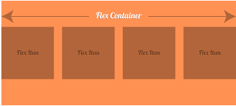
CSS3 Flexible boxes also known as CSS Flexbox, is a new layout mode in CSS3.
The CSS3 flexbox is used to make the elements behave predictably when they are used with different screen sizes and different display devices. It provides a more efficient way to layout, align and distribute space among items in the container.
It is mainly used to make CSS3 capable to change its item?s width and height to best fit for all available spaces. It is preferred over block model.
The CSS3 flexbox contains flex containers and flex items.
Flex container:The flex container specifies the properties of the parent. It is declared by setting the display property of an element to either flex or inline-flex.
Flex items:The flex items specify properties of the children. There may be one or more flex items inside a flex container.

Note:Flexbox specifies how flex items are set inside a flex container. It sets the flex items inside a flex container along a flex line. By default, there is only one flex line per flex container. Everything outside a flex container and inside a flex item is considered as usual.
Let's take an example to show three flex items within a flex container. By default, they are set along the horizontal flex line, from left to right:
See this example:
Following is a list of CSS3 Flexbox properties:
| property | description |
|---|---|
| display | it is used to specify the type of box used for an html element. |
| flex-direction | it is used to specify the direction of the flexible items inside a flex container. |
| justify-content | it is used to align the flex items horizontally when the items do not use all available space on the main-axis. |
| align-items | it is used to align the flex items vertically when the items do not use all available space on the cross-axis. |
| flex-wrap | it specifies whether the flex items should wrap or not, if there is not enough room for them on one flex line. |
| align-content | it is used to modify the behavior of the flex-wrap property. it is similar to align-items, but instead of aligning flex items, it aligns flex lines. |
| flex-flow | it specifies a shorthand property for flex-direction and flex-wrap. |
| order | it specifies the order of a flexible item relative to the rest of the flex items inside the same container. |
| align-self | it is used on flex items. it overrides the container's align-items property. |
| flex | it specifies the length of a flex item, relative to the rest of the flex items inside the same container. |